
GRAIL needed to expand its Galleri cancer screening test from a benefits-only ordering flow to a direct-to-consumer onboarding system. This project redesigned and rearchitected the end-to-end ordering experience to accommodate the complexity of telemedicine, regulatory, and cross-functional constraints while reducing friction for patients.
Expanding Galleri to the general public
GRAIL initially offered its early cancer detection test only through employer benefits programs or with providers directly. As the company expanded to nationwide direct-to-consumer access, the ordering experience became the primary acquisition funnel.
- Increase activation and successful order completion without compromising medical rigor or compliance.
- Opening access to the public dramatically increases potential friction, support burden, and abandonment which directly impacts revenue and trust.
A flow built for one model, asked to serve another
The test launched to the public with great momentum. Unfortunately, we were met with a lot of critical observations:
- Significant drop-off at account creation
- High volume of login-related support tickets
- Continued abandonment during medical intake
- Frustration with ~23 minute long form to submit
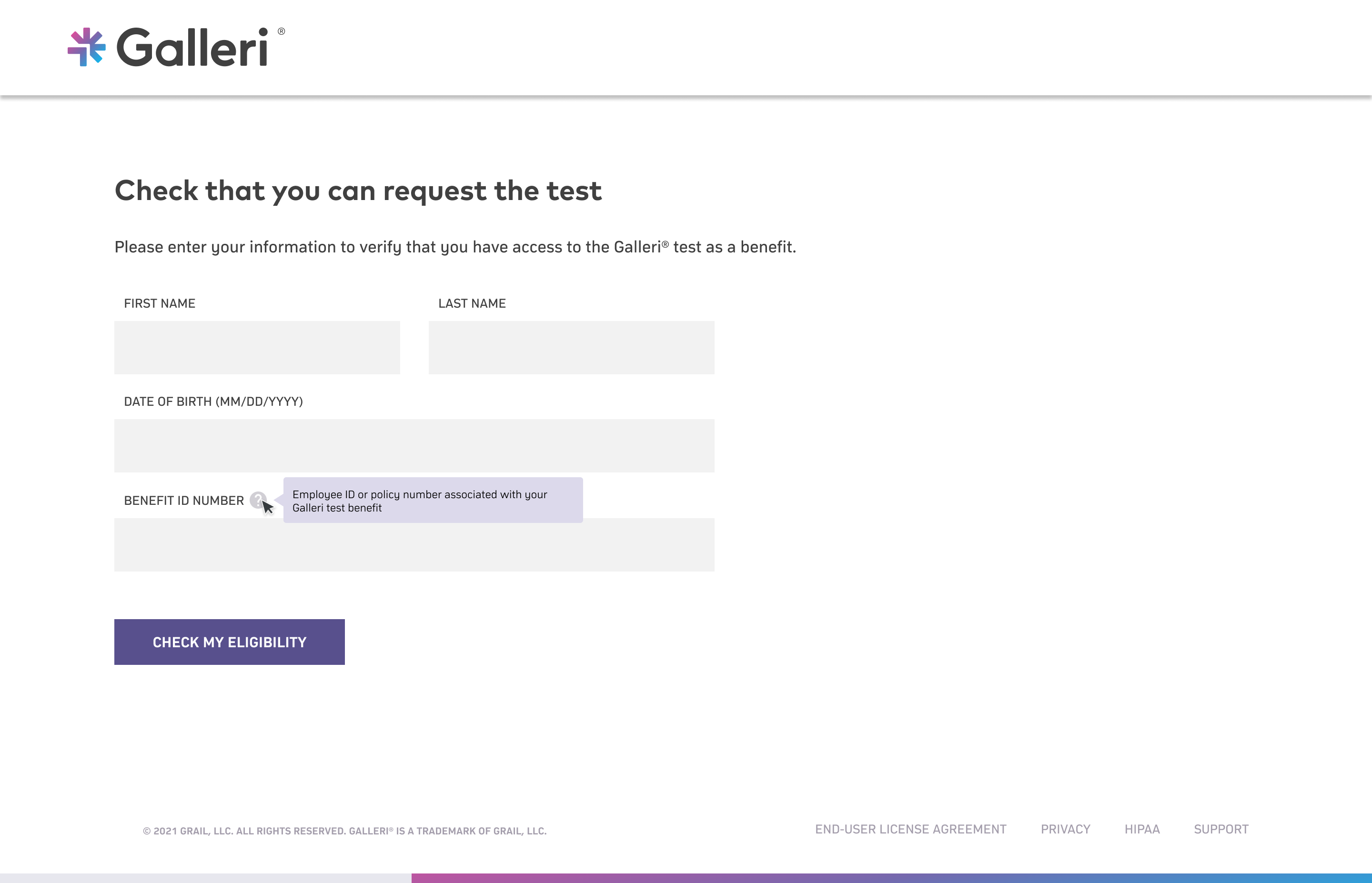
- Mandatory account creation before even determining eligibility
- Long, convoluted intake flow mixing eligibility screening, medical questionnaire, and compliance requirements
The system was optimized for structured benefits access, not public onboarding.
Research revealed two distinct key insights
I ran moderated usability sessions, analyzed metrics, and went onsite to different Galleri events to discover the root of the problem. This uncovered two points:
What we were working within
Capturing user buy in immediately
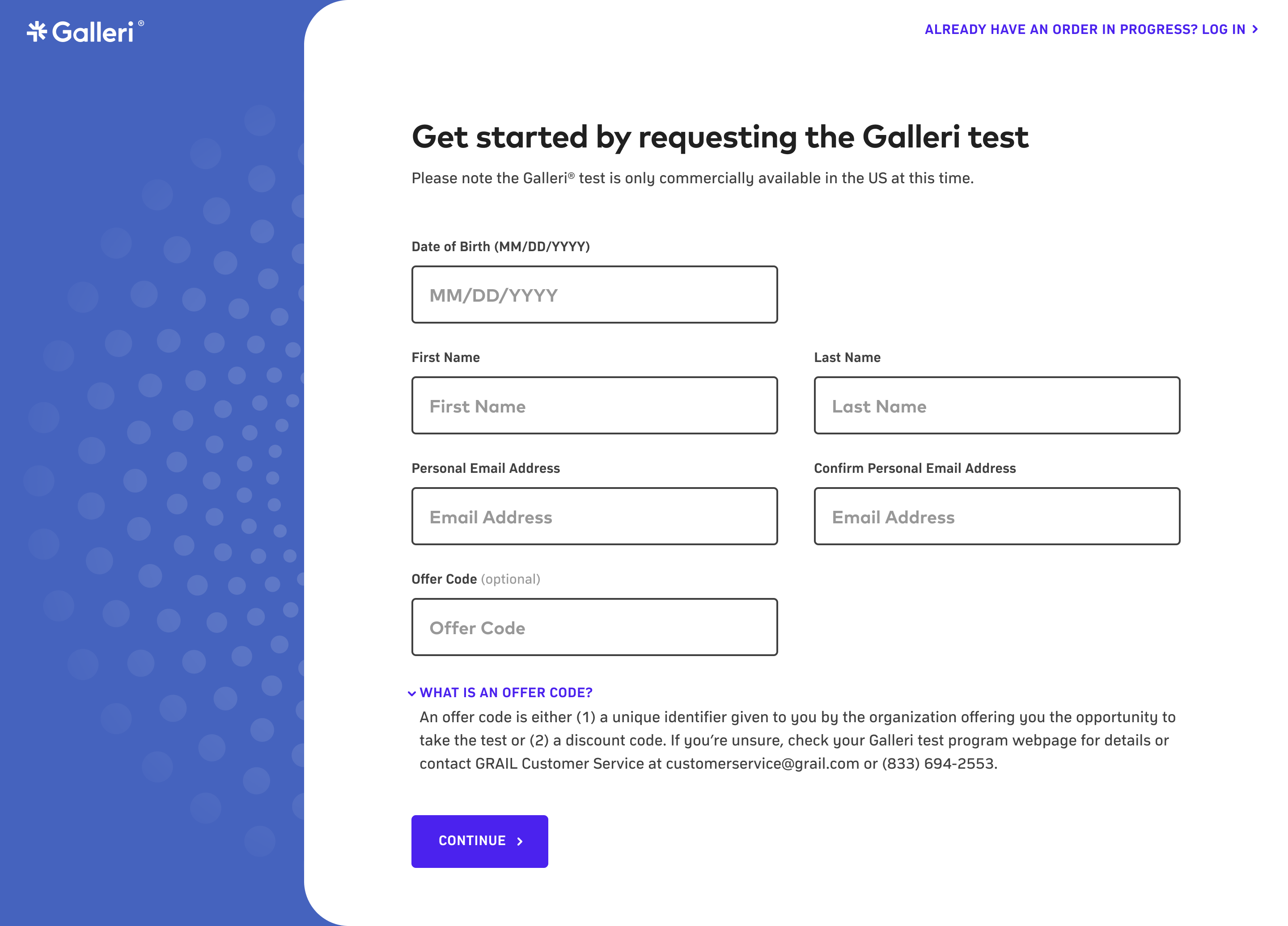
Our hypothesis was that if we capture intent before requiring full account creation, abandonment will decrease. And so I made the following changes:
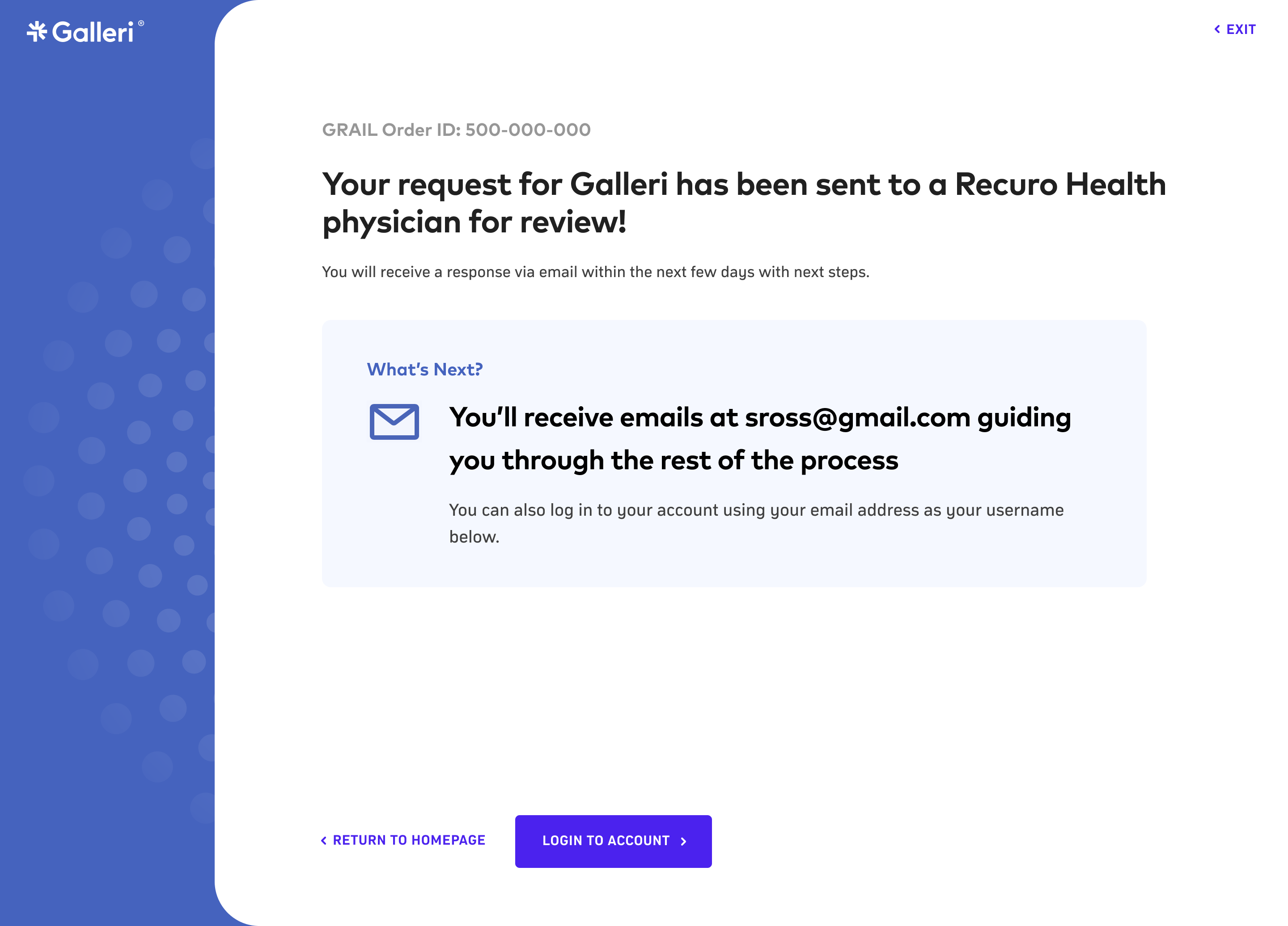
- Introduce guest checkout to capture the orders and buy in from user immediately
- Have the system create an account using the information provided on the intake form
- Implement passwordless magic-link authentication for seamless account creation and login experience
We realized the issue wasn't the account creation itself, but when it appeared. We were essentially asking for commitment before the users had confidence.
By allowing users to move forward first and formalize the account later, we aligned the system with natural decision-making: curiosity → clarity → commitment.
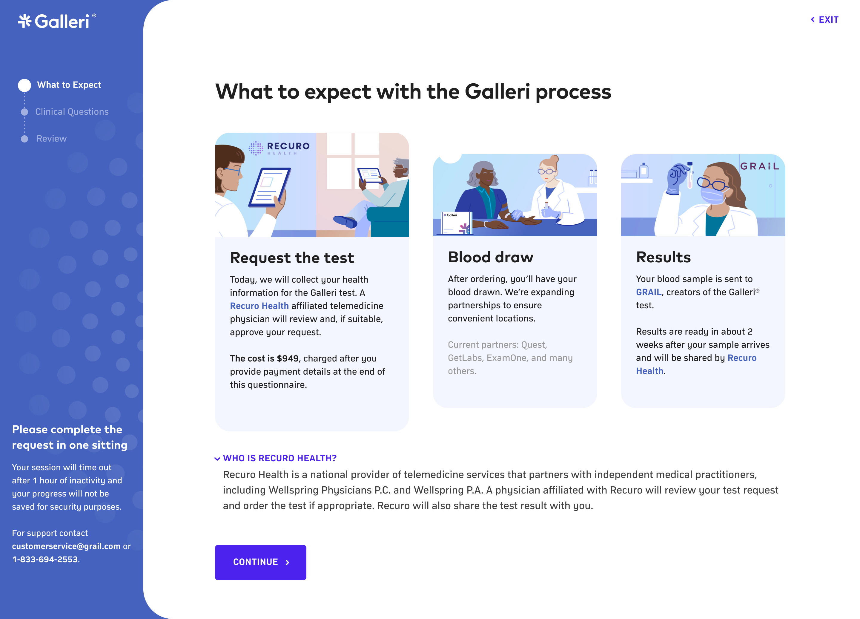
Turning a long form into a guided workflow
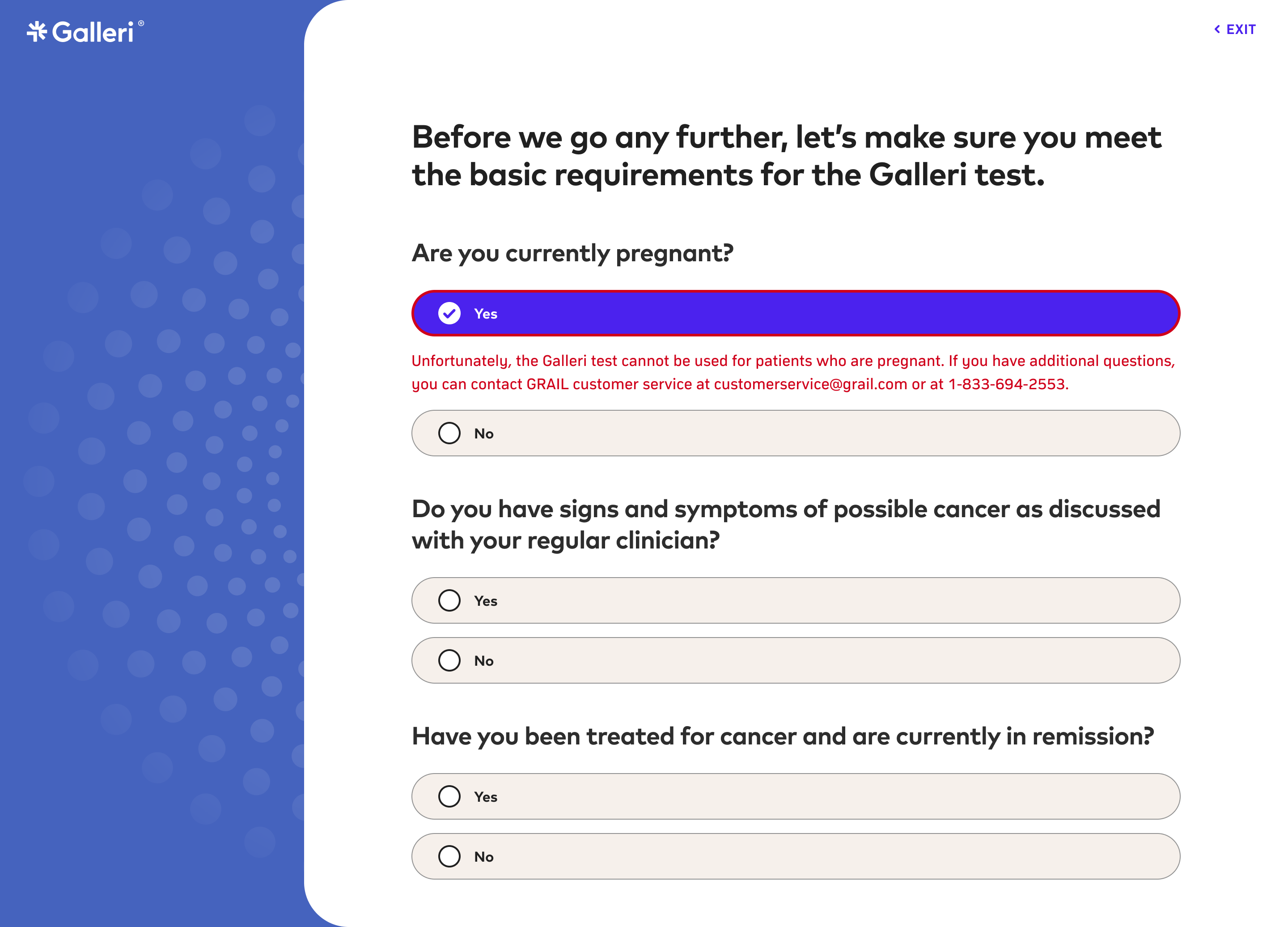
If users are guided with more structured steps and presented with eligibility gates early in the process, more users will complete their orders without feeling overwhelmed. With this theory in place, I made the following changes:
- Previously, all users had to complete the same 6 steps to even determine eligibility. Now, if a user is not eligible, they only need to complete the first step.
- Introduced progressive disclosure instead of presenting everything at once
- Consolidated redundant fields with the Medical Affairs team
- Organized sections around how patients think about their health, not how our systems store data
The problem wasn't the length but the structure and guidance.
When the form felt dense and clinical, patients hesitated. When it felt guided and sequential, they moved forward with confidence.

What the data showed after launch
We launched the changes after thorough user testing to compare the redesigned flow against the legacy flow. Results were measured across completion rate, time-to-order, support ticket volume, and surveys.
The changes successfully shifted the experience from feeling overwhelming to feeling very structured. And importantly, we achieved this without compromising any medical or compliance requirements.
What I'd continue exploring
The biggest lesson from this project
With friction reduced at checkout, the logged in portal was open to a lot more opportunities to better the patient experience:
- Clear, assisted explanations of the test results
- Guide to next step after test results
- Test results history and ongoing health tracking
- Saved medical profiles for future orders
I'm proud that the work didn't just improve conversion but it also created a stronger foundation for long-term patient trust.
