Case Studies
Re-architecting an employee benefit-only ordering flow into a scalable direct-to-consumer onboarding workflow
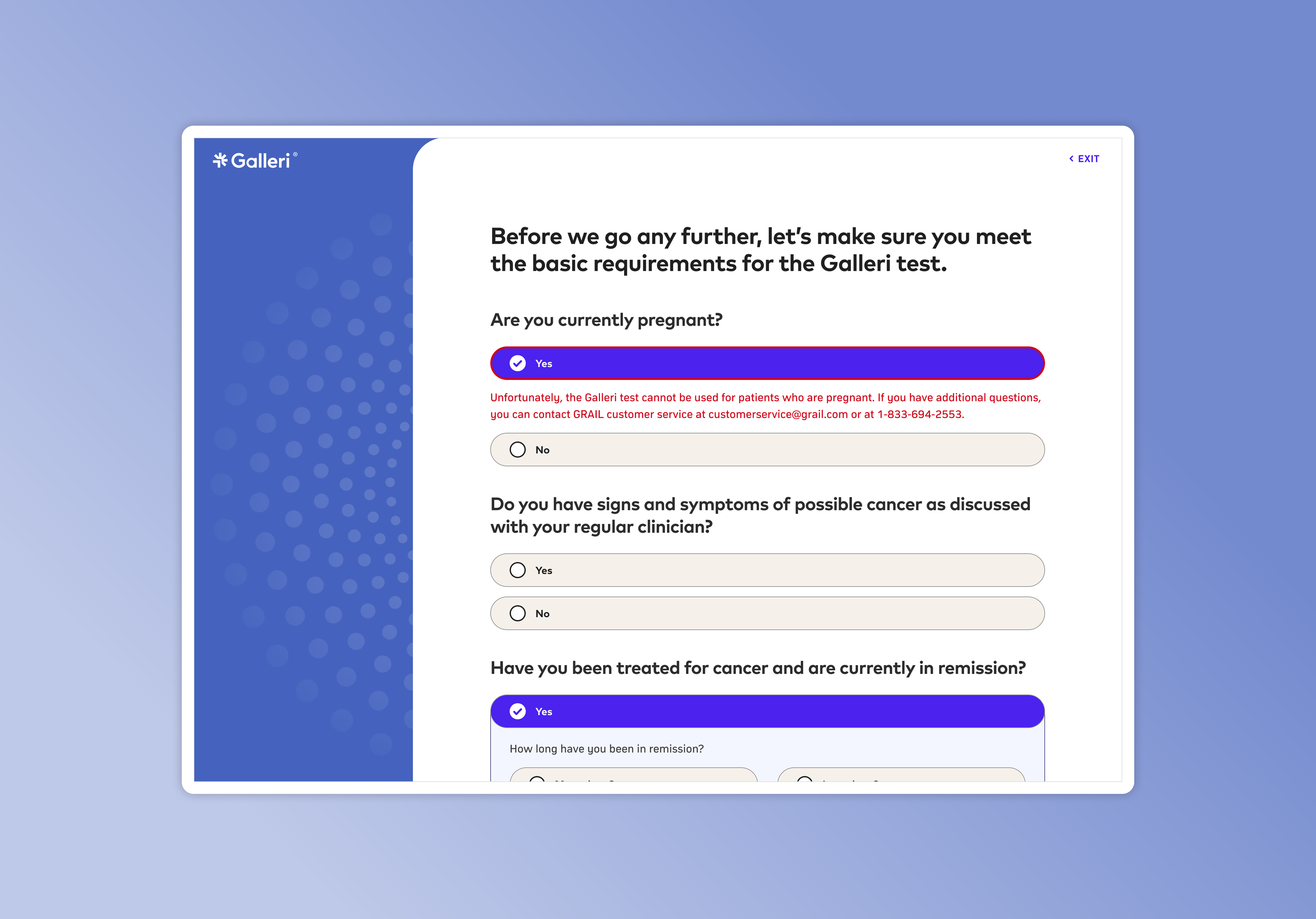
Redesigned the patient ordering experience for GRAIL's nationwide cancer screening test that significantly increased completed orders while dramatically reducing login-related support requests.
Replacing fax-based clinical orders with a digital provider platform for healthcare organizations
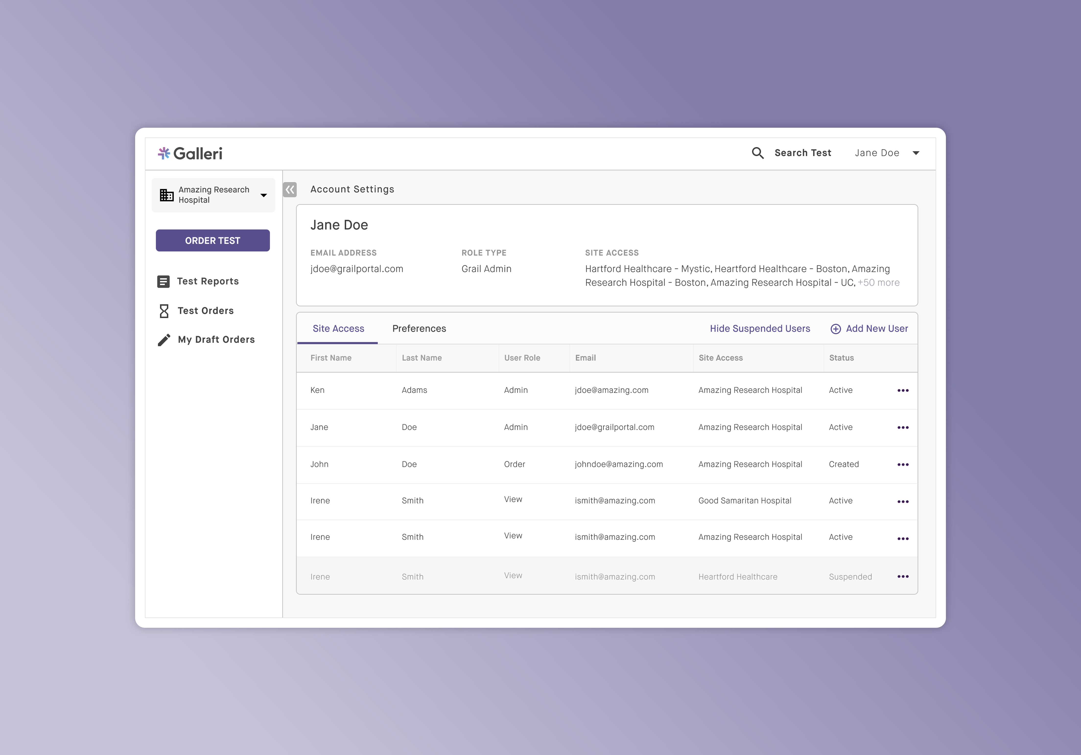
Led the design of GRAIL's provider portal enabling healthcare organizations to securely submit and manage test orders digitally, eliminating a large portion of manual corrections caused by fax-based submissions.
Designing the logistics workflow behind 98.4% on-time delivery at scale
Built AxleHire's driver platform to support high-volume, multi-parcel delivery operations, restructuring assignment lifecycles, inventory scanning, and failure handling to scale reliability across 120k weekly deliveries.

Unlocking operational scalability with a client self-service delivery management portal
Designed AxleHire's first client operations portal, giving enterprise customers real-time delivery visibility and automated order ingestion while reducing dispatch support requests by ~80%.
